

Prestige Moving (Ottawa) case: website, Google search and the path to a quote.
First Maksym looks at Prestige Moving the way a customer would, then he opens the technical tools. Where could the site be losing quote requests? What does PageSpeed say? How does the company look on a Google results page? He lands on 4.8 out of 5.
- Hosted by
- Maksym Stepanenko, founder of Marketing MIX, building websites since 2012
- Length
- 22:29 ·
The video is in Russian. The chapters and the full transcript on this page are in English. Watch on YouTube ↗
What the video covers, minute by minute
- 00:00
Intro: three Ottawa moving company websites
Maksym Stepanenko sets up the format: three Ottawa moving company websites checked for room to improve. Prestige Moving goes first.
- 00:28
Prestige Moving's first screen
The first screen: a huge video, a clear mega menu and an overloaded hero section. A comparison with the Vancouver page and the idea that the request form belongs right on the first screen.
- 02:19
Buttons and the request from the first screen
First-screen buttons and the jump to a separate request page, the video further down, SEO blocks, Google testimonials and the first service packages without prices.
- 04:37
Service packages without prices
Packages without prices make the client work out how many movers they need; an interactive estimate fits better. SEO text written for robots, long blocks and an FAQ that AI models can use.
- 06:11
Internal linking and AI slop in images
Internal links from the home page to inner pages, a form at the bottom for the warmest visitors, a routes block for AI answers and a collage that looks like AI slop. Then on to the technical check.
- 08:21
PageSpeed: site speed
PageSpeed Insights: about 50% on mobile, first paint at 2 seconds, full render at about 8 seconds. The owner just hands the report to a developer with a 90–95% target; SEO scores 100%, agentic browsing scores lower.
- 10:23
Structured data and rich results
The developer fixes PageSpeed suggestions straight from Google's list. The Rich Results test found no errors in Prestige Moving's markup; next up, meta tags.
- 12:17
Fighting for the snippet in Google results
How the site looks in search for “Ottawa Movers”: rating counts in the snippet, a memorable title, special characters, a snippet image, social previews and numbers in the title.
- 16:49
Title and Description
The description shapes the snippet, search engines and AI models read it, and it still plays a role in ranking. Keyword stuffing in Prestige Moving's meta description works against the site.
- 18:16
How many pages are indexed
The number of indexed pages via a site: search (no Search Console access): up to 3,000. Publication dates in snippets, a request form that should come back to the first screen, and error messages next to the field.
- 21:00
Inner pages, menu and About
The mega menu disappears on inner pages, the About page has no team faces and an empty blue banner, and new colors show up on Contact. Final rating: 4.8 out of 5.
Key points from the Prestige Moving case
Visitors see right away that this is a mover. The extra blocks and social icons on the hero just get in the way.
A separate request page is one more step. Typing a phone number into a field on the home page, or in a pop-up, is easier.
Packages with no price help very little. A calculator built on the size of the move beats a list of two, three or four movers.
Pulling testimonials straight from Google is a strong trust signal.
Set up right, an FAQ section and marked-up routes end up in LLM answers.
Google and AI models both care about speed. On mobile Prestige Moving scores about 50%: first content at 2 seconds, full load around 8.
Red and yellow zones in the PageSpeed report go to the developer, target 90–95%. The Rich Results test shows no errors for Prestige Moving.
You can tune a snippet: ratings, numbers in the title, an image for search results, a special character that catches the eye, a date on the page.
Search engines and AI models read the meta description, so stuffing it with Ottawa, Moving, Movers hurts. An About page with no team photos looks unfinished.
Full transcript by chapter
Open a chapter to read what was said in it. The timestamp starts the video at that point.
00:00Intro: three Ottawa moving company websites
GTA 6 is finally out. Anthropic has finally gone public, done its IPO. And today we're looking at how to check your own websites for things to improve. We've got three sites in to look at, so let's run through all of them.
We're starting with Ottawa Movers, Prestige Moving, on a .ca domain, which is a good sign right away.
00:28Prestige Moving's first screen
The first overall impression is pretty interesting. Basically, we've got a huge video here. The top left corner, where users usually start, tells you that yes, this is delivery, I mean moving. The only thing I don't get is why there's a plane here, but that's a minor thing.
The menu shows clearly what sections there are. It's built as a mega menu, so we can jump around from here too. Login, sure.
What else is interesting? What's interesting is that this whole thing is pretty overloaded, in my opinion. This information here isn't super relevant. And I'd probably move the social media links somewhere down here too. Because otherwise the hero section, the first screen, is just way too heavy.
And again, here we've got Vancouver right away. Oh, by the way, it looks like the developer tried less on Vancouver. And because of that, if you compare them, this one is much calmer. Honestly, I like this one much better.
And again: it's thrown me somewhere else already, instead of just showing this in a modal so I could quickly type in my phone number. Or even put a phone field right here: I fill it in, click, done, my request is on its way. Come on, come on.
02:19Buttons and the request from the first screen
So this button was thought through, and this button wasn't quite thought through. Same with Call us today. Call us today probably means I'm already placing a call. Overall it's very good that there are testimonials, trust signals. The only thing is that it's all heavily overloaded.
And again, I don't quite get the logic of sending me to some separate page. Plus, given the quality of our internet here in Ottawa, and in Canada in general, that page might not load as fast as it does for me on Wi-Fi. Well, that's how it is. Okay, the first screen.
Next, the home page walks us through some information. This video could probably have been loaded onto the first screen somehow, so I could watch it. All of this is done for SEO: the markup, the bold text, the search keywords, the internal links, all of that is good. These things are cool.
The testimonials are good too. It's really cool, by the way, that the testimonials, we do it this way too, load straight from Google. Clients see... I don't know, it's unclear why out of 400 testimonials they keep showing me what seem to be the same ones. Yes, the same ones. Well, fine, whatever. It would be nice to make the avatars a bit bigger here. But overall it's really great that they load from Google: a person sees that it's all real and nobody's making it up.
Some packages, some packages. Again, packages with no price. I really don't understand why they're showing me this. Well, fine, whatever. And once again some icons, little stars, unclear what for, but that's okay too, nothing terrible.
Oh, and we've only scrolled through half the page. In any case, far from everyone scrolls down this far. Overall, I'm even a bit tired already.
04:37Service packages without prices
Packages again. And again, packages with no price. Again, it's not quite clear why I need this. And again, why should I read all this and figure out how many movers I need: three, four or two.
It would probably make more sense to build some interaction based on my needs: how much stuff I need to move. I'd probably have to enter it somewhere. Maybe even leave my contact details for an estimate, I don't know. But it doesn't matter, at least I should enter it, and it should calculate automatically. Maybe even build some little interactive thing there.
This is pure SEO text. Nobody's going to read it, of course, except robots. It was written for robots. Okay, fine. The locations there, in Vancouver, that's good too, that's cool. SEO again. More endless icons. I don't know, I'd still trim the blocks a bit, but whatever.
This again, I'm not reading it. I don't even understand what it is, some kind of things. I'm just going to scroll, scroll, scroll past it. Actually, that's okay, that's normal: most people will do exactly that.
Oh, absolutely, absolutely: Frequently Asked Questions. This is great for LLMs, great for AI models. They'll take information from here and add it to their answers. If everything is set up correctly, of course.
06:11Internal linking and AI slop in images
Internal linking again. From the home page we can pass weight to an inner page, that's good too. And again. I guess I don't really like the closed question here. I'd still add something here from a marketing point of view.
And I'd definitely, this is already a form. It's for the people who scrolled all the way to the very bottom, so the most patient and, accordingly, the warmest leads. I'd still add a smiling person here, doing something.
This is another great thing, basically. And again, it's interesting, it's nice, the programmer did a good job. But man, it's all very complicated, very much. And again, when I'm already really tired, I don't know how relevant all this is. But from an SEO standpoint, yes, it's cool. These are precalculated routes. And most likely, if it's marked up correctly for AI, it'll get pulled into AI answers. That's the whole story.
And again: only 16. Man, that's really, really not bad. The only thing I don't get is why they made this strange collage that smells a bit like AI slop. Especially since I'm sure they have plenty of good, ordinary, normal photos. Maybe someone's car was standing here and they cropped it out. Anyway, I'm nitpicking a bit now, because the site really is pretty good.
By the way, now we'll look at the technical side and see what's going on there. And then it'll be clear how much weight all of this really carries. We've built ourselves this nice front page so we can open all of this quickly.
08:21PageSpeed: site speed
So the first thing we check is PageSpeed. PageSpeed has a big effect both on the user experience and, of course, on ranking in Google. If a page loads slowly, if a page loads with errors... Strange. Okay, let's see. That's very strange, very low. I don't even know why, that can't be right. That's really bad.
If a page loads slowly and, let's say, with errors, then of course it affects ranking, directly, both in Google and in AI models. So you have to... Well, this one looks better. Maybe there's something off with my internet, because 50% is really bad.
Here's what we see: first paint of the page is 2 seconds. That's also very long, by the way, that's not great, it can be improved. And then the page fully renders in 8 seconds, also bad. So basically there's something to work with. This is on mobile. By the way, we never really looked at how it behaves on mobile. But I assume these numbers are exactly the result of something being questionable somewhere there.
And basically, there's no point in a business owner digging deep into all of this. You just hand it to a tech person and say: "Hey, tech guy, get me 96%, please." Or at least 90%. Well, better at least 95.
SEO is 100%. So somebody there really knows what they're doing, that's a plus. But agentic browsing for AI agents is already worse.
10:23Structured data and rich results
Maybe some old markup was used. There's something to work on: something with the markup, some issues there. So PageSpeed comes first, right away. On desktop, yes, everything should already be much better. Although, again, this here is also bad. And look how many points for improvement.
Basically, you don't even need to think much here. The developer should just fix all of this on their own. There's nothing super complicated here: Google tells you, you take it and do it. Same with markup, it's very easy to fix. None of this is hard to do at all.
What's next? PageSpeed is basically clear: you just drop the site in and look. If it's red or yellow, you hand it to the developer, that's it. It should happen automatically.
Rich results test. Let's see what we've got: additional search features, structured data, that is, Rich Results, markup. Basically everything here is very normal for them, no errors, everything is okay. PageSpeed showed us the same thing: from a search optimization standpoint everything there is polished to perfection and all good.
Meta tags. Meta tags are an interesting thing too: what's marked up and how. And here we see, first of all, a very interesting story.
12:17Fighting for the snippet in Google results
We see the snippet, that is, how the website will look in search. When there are 10 websites on the page, that's exactly where the fight for the snippet happens. And fighting for the snippet really makes sense.
Say we type in Ottawa Movers. Ottawa Movers. These are paid ads, this is Google Maps, and here come all our wonderful movers. We see two snippets next to each other. Again, seemingly similar companies. But look: here there are a thousand five-star ratings. And here I don't know how many ratings there are. Well, actually, I do know: Ottawa Pro Movers also has about a thousand ratings. But for some reason nobody knows that. And that's a problem.
What's next? Your Professional Ottawa Movers. Yeah, cool. Ottawa Movers, Moving Service Company, worse. What are they all called? Ottawa Pro Movers, Ottawa Best Movers, Ottawa Good Movers. Honestly, I couldn't care less, because I can't remember any of it. Ottawa First Movers and so on. And again, Men in Trucks, Two Men and a Truck, I couldn't care less. But Your Professional Ottawa Movers... Sure, I understand they wrote that about themselves. But either way, something about it will stick somewhere in the back of my mind.
Hold on, I'm trying to find it, there are some more interesting tricks, I want to show them. I guess they haven't made it to Canada yet. Anyway, at the very least you can use special characters. Don't overdo it, but sometimes you can drop in a special character that works like a mini image in the text. When we scroll through same, same, same, bam, it catches the eye.
And this is interesting too: they have an image. The image is marked up specifically so it shows up in the snippet. I trip over this too. On the first page, I think, everyone has done it properly. No, actually, not everyone. Here they've already done it, well done. And here the image didn't get pulled in for these guys.
Again, we can't influence the snippet directly. We can use certain tricks to try to make it look the way we like. You can also try to squeeze quick questions in here. But Google will of course decide for itself how to show it: depending on the competition in the niche, depending on how trusted the site is, there are tons and tons of factors. So that's the snippet, and it can still be improved as much as possible.
What's this? This is the snippet for how a post will look on Twitter, how a Facebook post will look. Again, why can't I see Ottawa Movers in huge letters here? I can, right? I can. This is so hard for me, guys. Take note, Prestige Moving, if you ever watch this video. This can be used too. This is also our advertising space, so to speak. We have to squeeze every last drop out of it, down to the last penny.
What do we have here? Some image here. Again: Ottawa Movers, Residential, Commercial and Long Distance. Basically, yes, it's all good. Maybe add something more, some 100% of something. I'd like to see some numbers here too, a number or numbers, something. But it's really cool as it is, because this title looks really good.
And again, Prestige Moving don't write this in the header, because basically nobody cares except the owners, of course. Although for some reason they stuck it into the description.
16:49Title and Description
The description is, again, on the one hand, what the snippet is built from. Plus, the description is read one way or another by search engines and AI models. Search queries get pulled from it too, and it plays a role in ranking. Much less than at the dawn of SEO, some 15 years ago, but it still plays a role. I'm a thousand percent sure of it. It counts for more than, say, plain text, just regular text on the site.
There: This is commercial, this is my services. Okay, now. From Ottawa, Ottawa, Ottawa 1, Ottawa 2. How relevant that is, is a big question. Moving, Movers, Moving. Stuffing too many search keywords into a meta block isn't great either.
By the way, there's not much information on this site to analyze. Fine, okay, let's move on to the next one.
18:16How many pages are indexed
And here we just typed in the site prestigemoving.ca and looked at which pages from this site are in Google's index. We do it this way because, naturally, we don't have access to their Search Console. Otherwise you just open Search Console, and the number of indexed pages will be right there.
We won't count them here. So roughly how many do we have? 10 pages on each... 140. Basically, there should probably be thousands here. Well, not that many, actually, not that many. 250 plus 2,600, so up to 3,000. I expected a lot more. Well, okay, that's fine too.
All the snippets are a bit boring. And this, by the way, is another great thing. When we put a publication date on a page, first of all, it shows up in the snippet. Not always, but most of the time. Second, it also affects ranking a little: Google sometimes tests newer articles higher than we're used to seeing.
I'm not a big fan of clients like this. Because when, roughly speaking, 80% is already good, it's pretty hard to squeeze out that mysterious remaining 20%.
But again, the main thing: I can really picture the owner coming to the developer or to the marketers who handle it and saying: "Guys, yeah, you did a cool job, but something's missing here." And they had to turn a good, clean page without extra elements into this thing. Which, in my opinion, is heavily overloaded in this part. And this part is the opposite: this is exactly the part I'd add more to.
Look, here's what they had. I don't need to click anything extra. I just enter my details here, even with autofill, click, and that's it, it's sent. By the way, this is also a classic bug. I shouldn't even have to look down here: the error should pop up somewhere right here. In the same way, the notice that the form was submitted successfully should also pop up somewhere here. That's how it is. And overall, overall it's really, really...
21:00Inner pages, menu and About
Where did the menu go? I praised it too soon. Strange. Why is it different here? A bit strange. I'd definitely still add a mega menu here. I always really like a mega menu. Yes, I'm missing a mega menu here, to dive deeper, to have a look.
Here I'm badly missing faces, a team photo. For some reason there's a huge banner here, a huge space that isn't used at all, just painted blue. That's very strange. Apparently, guys, they got around to the commercial pages, but not to the blog and About.
And About is an important page. Especially when we've got a market with bloody, blood-red competition, like moving. Then of course everything there has to be polished to perfection. So I have questions about this.
Contact, again. Out of nowhere a yellow color suddenly appears. It was on the home page. And here there's orange too. Okay, now I'm starting to nitpick. That's it. It's a good site. A solid 4.8 out of 5.
Get the same check for your website
Leave your site address in the request form. Marketing MIX, working since 2012, will go through it point by point and send the findings in writing.
How we build websites for moving companies →The other two Ottawa movers
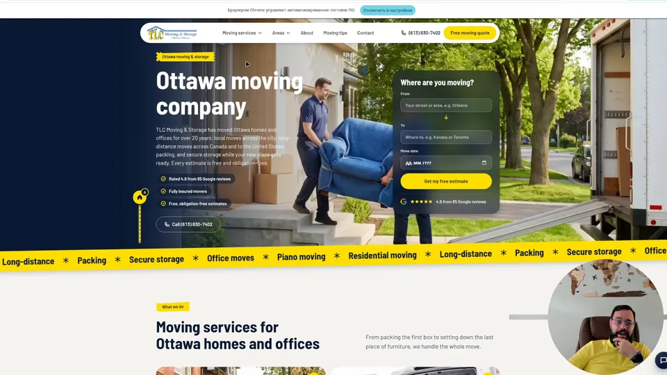 Part 2 of 3 · 26:02TLC Moving & Storage (Ottawa) case: website, Google search and the path to a quoteTLC Moving & Storage: technically solid, with room to grow in the pitch. Storage with no menu section, 20 years in business in small print, a long quote form. →
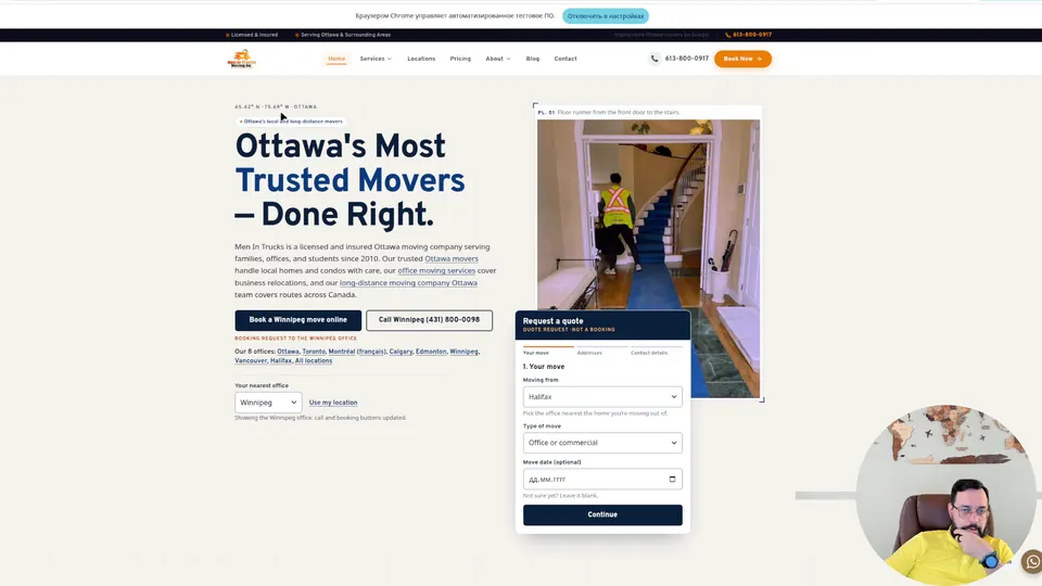 Part 3 of 3 · 28:56Men in Trucks (Ottawa) case: website, Google search and the path to a quotePart three of the series: the Men in Trucks website, with unedited AI copy, black text on a black background and strong facts in small print. It ends with the main principle: cut what is unnecessary. →